


14 New Fonts Added
Web Wisconsin • November 3, 2019
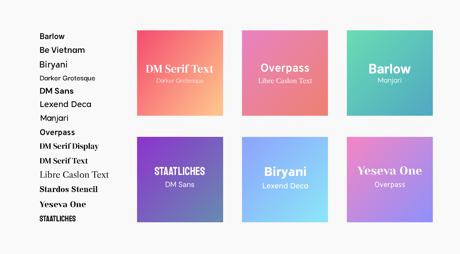
You’ve got 14 fantastic new fonts in the editor, making it easier for you to create modern-looking sites, easily and effortlessly.
These new fonts include both serif and san serif fonts, fun fonts that are perfect for titles and buttons, and more serious fonts that are right for paragraphs and bullets.
You’ll find the new fonts where you find all fonts in the editor: go to Global Text > Global Design panel or open the text editor and click on style. Simply choose the font that’s right for the look and feel of your site, and refresh the design in moments.
You can also use the new fonts to easily update a favorite template. Just open the template in template mode, change the font via Global Text, and you’ll change the entire template's look and feel.
A few tips about using fonts wisely
Fonts are a wonderful tool for supporting a site's distinct tone and style, and they need to be used wisely.Here are some tips for choosing your site fonts.
- Use two (maximum three) fonts in a single website.
Too many fonts can be distracting and unattractive. Use a single font for paragraphs and general texts; use no more than two fonts for titles.
- Choose serif fonts for a more serious look.
Serif fonts have little feet attached to the ends of the letters. They tend to look more traditional and formal.
- Choose san serif fonts for a more relaxed look.
Sans serif fonts don’t have the little feet on the ends of the letters. They tend to look more modern and are easier to read on titles, buttons, and short texts.
- Use bold, fun fonts for titles and short texts.
This is the place for using eccentric fonts as they draw attention to the text.
- Make sure fonts are easy to read.
For paragraphs, a good font size is 15 to 18px. For titles, go for something bigger (40 to 100px).
GET THESE AWESOME FEATURES & MORE!
Click below to get our free updates by email, or if you're not already a client, click to schedule a free demo so we can help your business connect & grow!
Featured Article:
FREE ✨ AI Digital Staff for the rest of 2024!
This is the biggest and best Black Friday Special that we have EVER offered at the BEST PRICE that anyone could ever ask for (FREE) and we're even offering it to you EARLY so you can enjoy it starting today: Friday, November 15th through the rest of 2024!!
Other Recent Articles From Web Wisconsin:
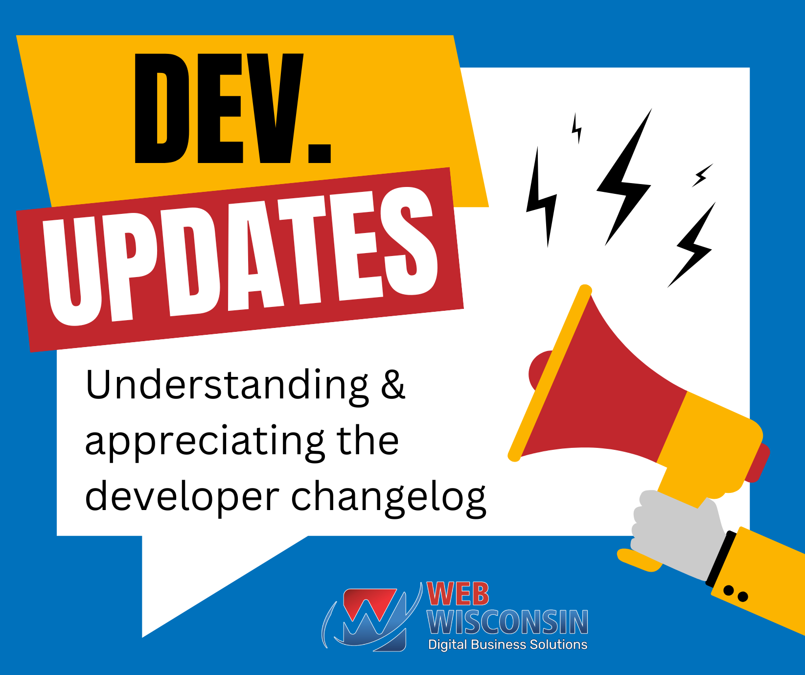
We are so thankful and appreciate all of the daily updates that our Developer Team works hard to give us!
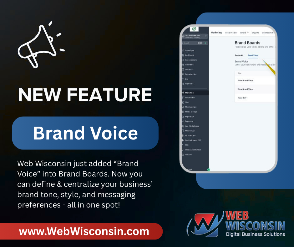
Features & Updates about Connect all-in-one business solution by Web Wisconsin
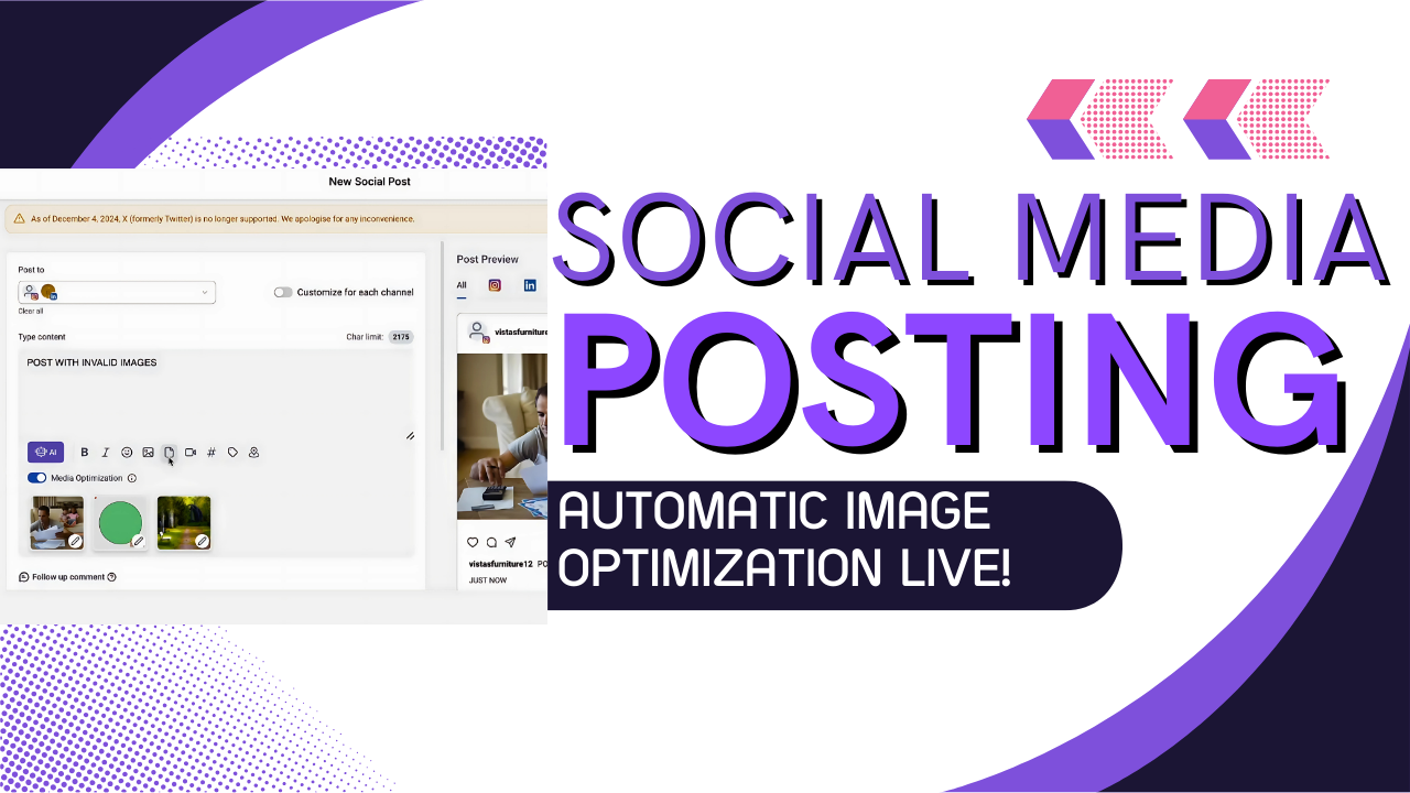
Introducing Media Optimization: Elevate Your Social Planner Experience